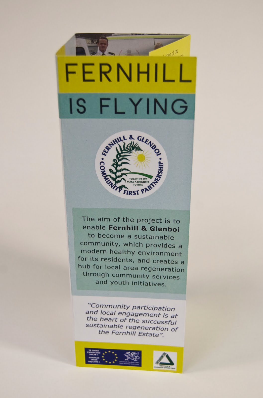
Below is my response to this workshop, including the images that I prepared as taught during this professional practice session. As this leaflet is being distributed throughout a relatively poor area where education may not be very strong, I have used an easy-to-read sans-serif typeface. This also helps to make the document appear more friendly and less corporate. Very soft colours have been used within the background, yet brighter blues and yellows have been used to attract the reader's eye across the page. While some of the text on the inside pages runs across the folds, it still remains legible as they fold inwards and prevents the text from running too narrowly down the page.


No comments:
Post a Comment